Build a Portfolio Website: HTML & CSS Tutorial
Ready to build your own website? In this step-by-step tutorial from AI Valley, the best web development institute in the Tricity area, you'll create a beautiful personal portfolio website from scratch using just HTML and CSS!
🎯 What You'll Build
A sleek, modern, responsive portfolio website with a hero section, about section, skills showcase, and contact form — the kind of website real developers use to land jobs.
📋 Prerequisites & Materials
A Text Editor: We recommend Visual Studio Code (free)
A Web Browser: Chrome, Firefox, or Edge
Basic typing skills — no prior coding experience needed!
Create a folder called my-portfolio with two files: index.html and style.cssStep 1: Build the HTML Skeleton
HTML is the structure of every website. Think of it as the blueprint of a house — it defines what rooms exist and where everything goes.
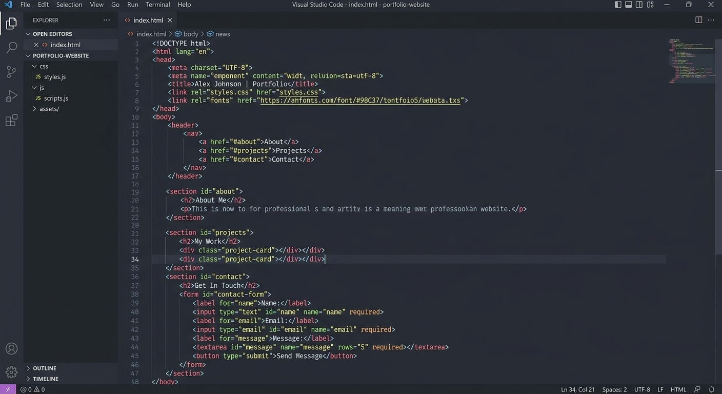
A code editor showing the basic HTML5 boilerplate structure
html
<!DOCTYPE html>
<html lang="en">
<head>
  <meta charset="UTF-8">
  <meta name="viewport" content="width=device-width, initial-scale=1.0">
  <title>My Portfolio - Built at AI Valley</title>
  <link rel="stylesheet" href="style.css">
</head>
<body>

  <nav class="navbar">
    <div class="logo">MyPortfolio</div>
    <ul class="nav-links">
      <li><a href="#about">About</a></li>
      <li><a href="#skills">Skills</a></li>
      <li><a href="#contact">Contact</a></li>
    </ul>
  </nav>

  <section class="hero">
    <h1>Hi, I'm <span class="highlight">Your Name</span></h1>
    <p>A passionate young developer from Zirakpur learning to code at AI Valley</p>
    <a href="#contact" class="btn">Get In Touch</a>
  </section>

  <section id="about" class="about">
    <h2>About Me</h2>
    <p>I am a student at AI Valley, the best coding institute in the Tricity area. I love building websites, robots, and AI projects. I'm currently learning HTML, CSS, JavaScript, and Python!</p>
  </section>

  <section id="skills" class="skills">
    <h2>My Skills</h2>
    <div class="skills-grid">
      <div class="skill-card">HTML</div>
      <div class="skill-card">CSS</div>
      <div class="skill-card">JavaScript</div>
      <div class="skill-card">Python</div>
      <div class="skill-card">Robotics</div>
      <div class="skill-card">AI</div>
    </div>
  </section>

  <section id="contact" class="contact">
    <h2>Contact Me</h2>
    <form>
      <input type="text" placeholder="Your Name" required>
      <input type="email" placeholder="Your Email" required>
      <textarea placeholder="Your Message" rows="5" required></textarea>
      <button type="submit" class="btn">Send Message</button>
    </form>
  </section>

  <footer>
    <p>Built with ❤️ at AI Valley, Zirakpur</p>
  </footer>

</body>
</html>
What this code does: We created a navigation bar, a hero section with your name, an about section, a skills grid, a contact form, and a footer. Each section has an id so the nav links can scroll to them.
Step 2: Style the Navigation and Hero
Now let's make it beautiful with CSS. Open
style.css and start with global styles and the hero section:
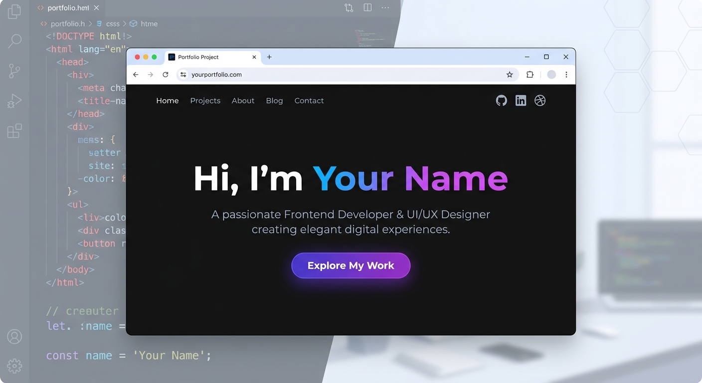
A browser showing a dark-themed hero section with large white text
css
/* Reset & Global Styles */
* {
  margin: 0;
  padding: 0;
  box-sizing: border-box;
}

body {
  font-family: 'Segoe UI', sans-serif;
  background-color: #0a0a0a;
  color: #ffffff;
  line-height: 1.6;
}

/* Navigation */
.navbar {
  display: flex;
  justify-content: space-between;
  align-items: center;
  padding: 1.5rem 5%;
  background: rgba(10, 10, 10, 0.9);
  position: fixed;
  width: 100%;
  top: 0;
  z-index: 100;
  border-bottom: 1px solid rgba(255,255,255,0.1);
}

.logo {
  font-size: 1.5rem;
  font-weight: 900;
  background: linear-gradient(135deg, #6366f1, #ec4899);
  -webkit-background-clip: text;
  -webkit-text-fill-color: transparent;
}

.nav-links {
  list-style: none;
  display: flex;
  gap: 2rem;
}

.nav-links a {
  color: rgba(255,255,255,0.7);
  text-decoration: none;
  font-weight: 500;
  transition: color 0.3s;
}

.nav-links a:hover { color: #6366f1; }

/* Hero Section */
.hero {
  min-height: 100vh;
  display: flex;
  flex-direction: column;
  justify-content: center;
  align-items: center;
  text-align: center;
  padding: 2rem;
}

.hero h1 {
  font-size: 3.5rem;
  margin-bottom: 1rem;
}

.highlight {
  background: linear-gradient(135deg, #6366f1, #ec4899);
  -webkit-background-clip: text;
  -webkit-text-fill-color: transparent;
}

.hero p {
  font-size: 1.2rem;
  color: rgba(255,255,255,0.6);
  margin-bottom: 2rem;
  max-width: 600px;
}

.btn {
  padding: 0.8rem 2rem;
  background: linear-gradient(135deg, #6366f1, #8b5cf6);
  color: white;
  border: none;
  border-radius: 0.5rem;
  font-size: 1rem;
  font-weight: 600;
  cursor: pointer;
  text-decoration: none;
  transition: transform 0.3s, box-shadow 0.3s;
}

.btn:hover {
  transform: translateY(-2px);
  box-shadow: 0 10px 30px rgba(99, 102, 241, 0.3);
}
Expected Output: Open index.html in your browser. You'll see a sleek dark-themed page with a gradient logo, a full-screen hero section with your name highlighted in a purple-pink gradient, and a glowing button!
Step 3: Style the Skills Grid with CSS Grid
CSS Grid is a powerful layout system. We'll use it to create a responsive grid of skill cards:
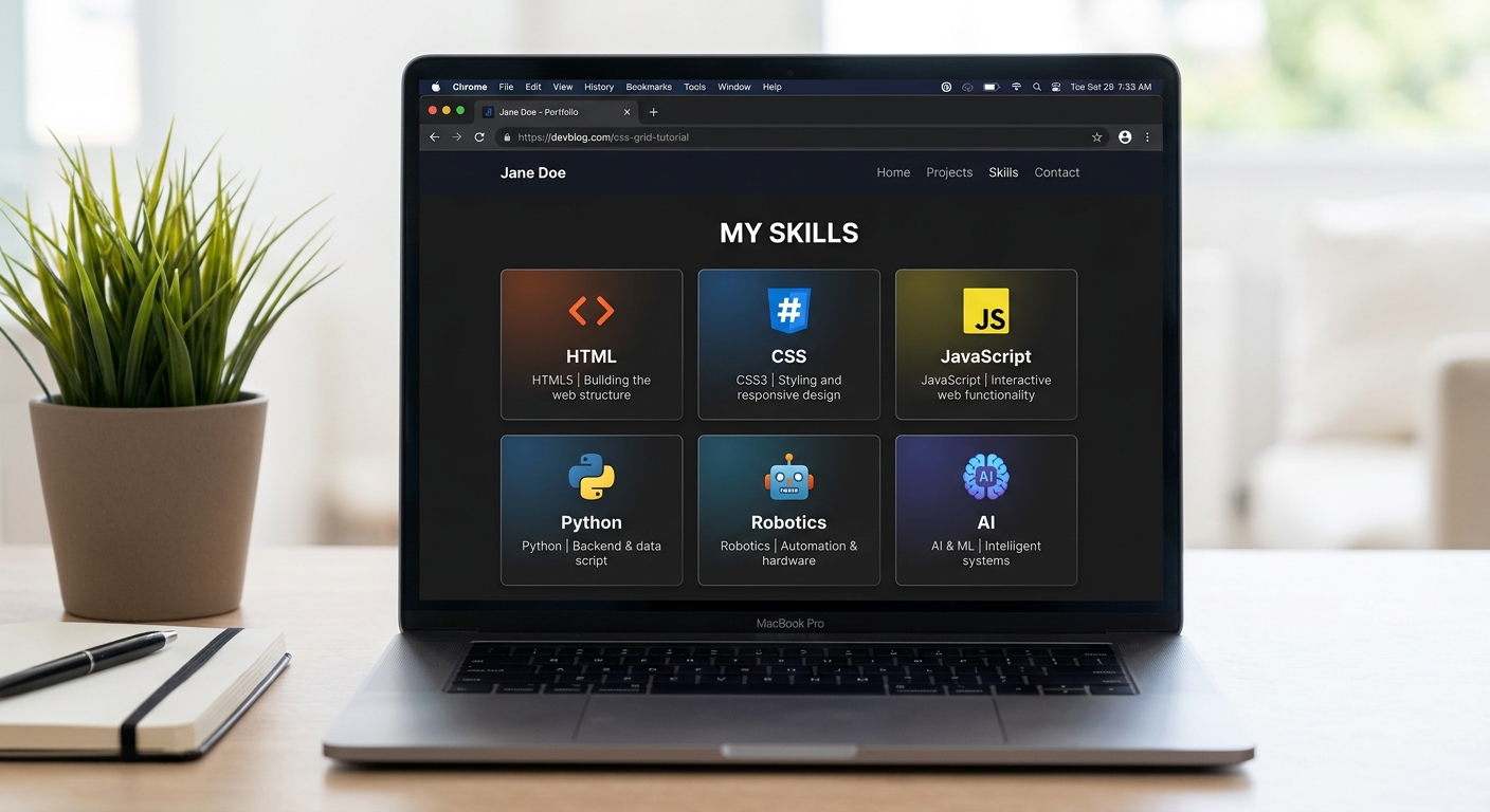
A browser showing six skill cards arranged in a 3-column grid with hover effects
css
/* About Section */
.about, .skills, .contact {
  padding: 5rem 10%;
}

.about h2, .skills h2, .contact h2 {
  font-size: 2rem;
  margin-bottom: 1.5rem;
  text-align: center;
}

.about p {
  max-width: 700px;
  margin: 0 auto;
  text-align: center;
  color: rgba(255,255,255,0.7);
  font-size: 1.1rem;
}

/* Skills Grid */
.skills-grid {
  display: grid;
  grid-template-columns: repeat(3, 1fr);
  gap: 1.5rem;
  max-width: 800px;
  margin: 0 auto;
}

.skill-card {
  background: rgba(255,255,255,0.05);
  border: 1px solid rgba(255,255,255,0.1);
  padding: 2rem;
  border-radius: 1rem;
  text-align: center;
  font-weight: 700;
  font-size: 1.1rem;
  transition: all 0.3s ease;
}

.skill-card:hover {
  background: rgba(99, 102, 241, 0.15);
  border-color: rgba(99, 102, 241, 0.4);
  transform: translateY(-5px);
}
Expected Output: You now have a beautiful 3-column grid of skills that glow purple when you hover over them!
Step 4: Style the Contact Form
Let's make the contact form look professional and polished:
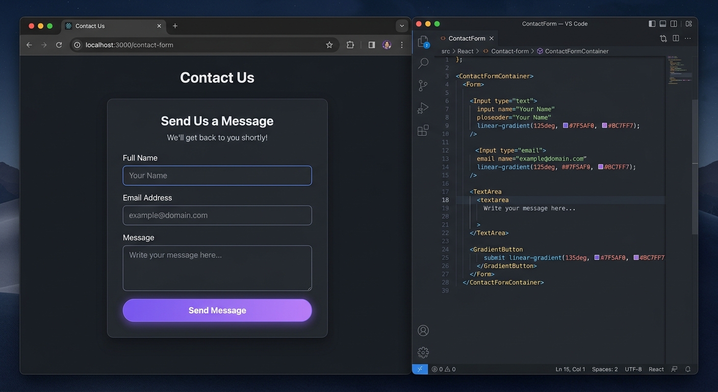
A sleek dark-themed contact form with styled input fields and a gradient submit button
css
/* Contact Form */
.contact form {
  max-width: 500px;
  margin: 0 auto;
  display: flex;
  flex-direction: column;
  gap: 1rem;
}

.contact input, .contact textarea {
  padding: 1rem;
  background: rgba(255,255,255,0.05);
  border: 1px solid rgba(255,255,255,0.15);
  border-radius: 0.5rem;
  color: white;
  font-size: 1rem;
  outline: none;
  transition: border-color 0.3s;
}

.contact input:focus, .contact textarea:focus {
  border-color: #6366f1;
}

/* Footer */
footer {
  text-align: center;
  padding: 2rem;
  color: rgba(255,255,255,0.4);
  border-top: 1px solid rgba(255,255,255,0.1);
}
Expected Output: Your portfolio now has a complete, professional contact form with smooth focus animations!
🎉 Final Result
You've built a complete, modern, dark-themed portfolio website from scratch using just HTML and CSS! You learned semantic HTML, CSS flexbox, CSS grid, gradients, transitions, hover effects, and form styling.
🚀 Challenge: Take It Further
Make it responsive: Add @media (max-width: 768px) queries to stack the grid on mobile
Add JavaScript: Make the contact form actually submit data using fetch()
Add animations: Use CSS @keyframes to animate the hero text on page load🏫 Learn More at AI Valley
Want to learn React, Node.js, and build full-stack apps?
AI Valley in Zirakpur offers the best web development classes in the Tricity area. Our project-based curriculum takes you from HTML basics to deploying production apps. Join students from
Chandigarh, Mohali, and Panchkula — enroll today!